Timeline: 6 months
Tools Used: FigJam, Figma, Adobe XD, Zoom, Google Meet, Pen & Paper
Paperfly

Paperfly is a platform that aims to revolutionize the way people send and receive packages, with a focus on ease, speed, and efficiency. Whether to send a single package or manage a large volume of deliveries, Paperfly promises that the job can be done hassle free.
Understanding the Brand
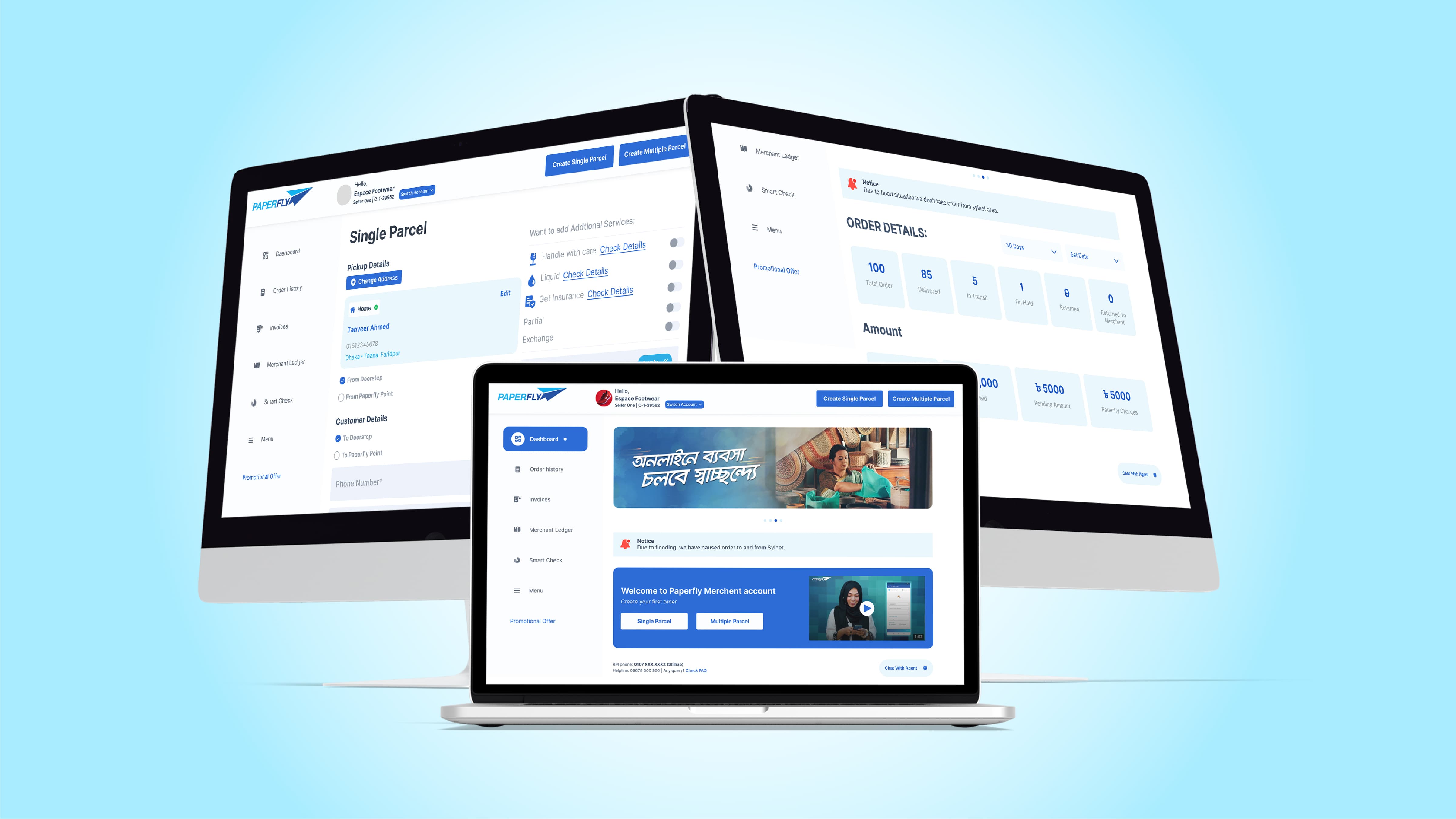
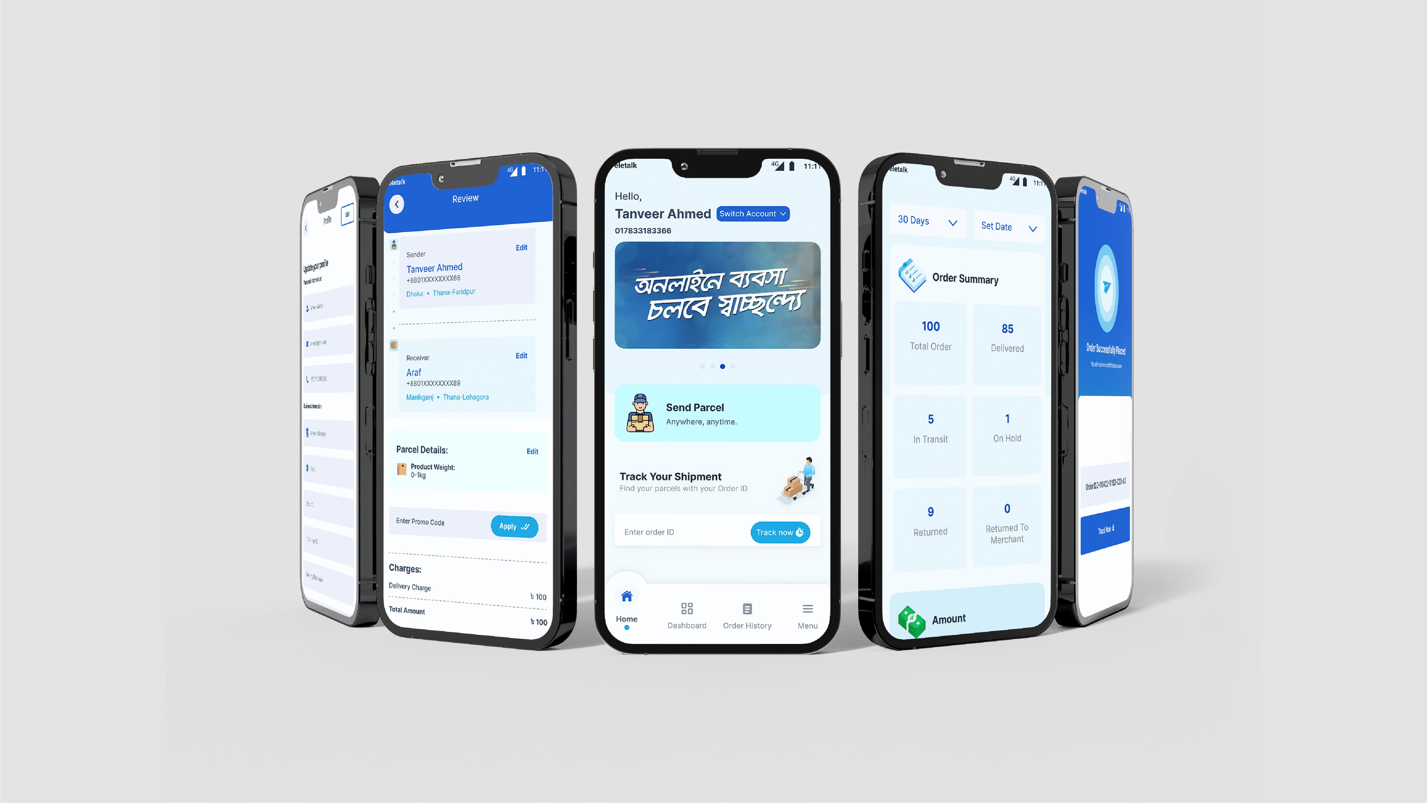
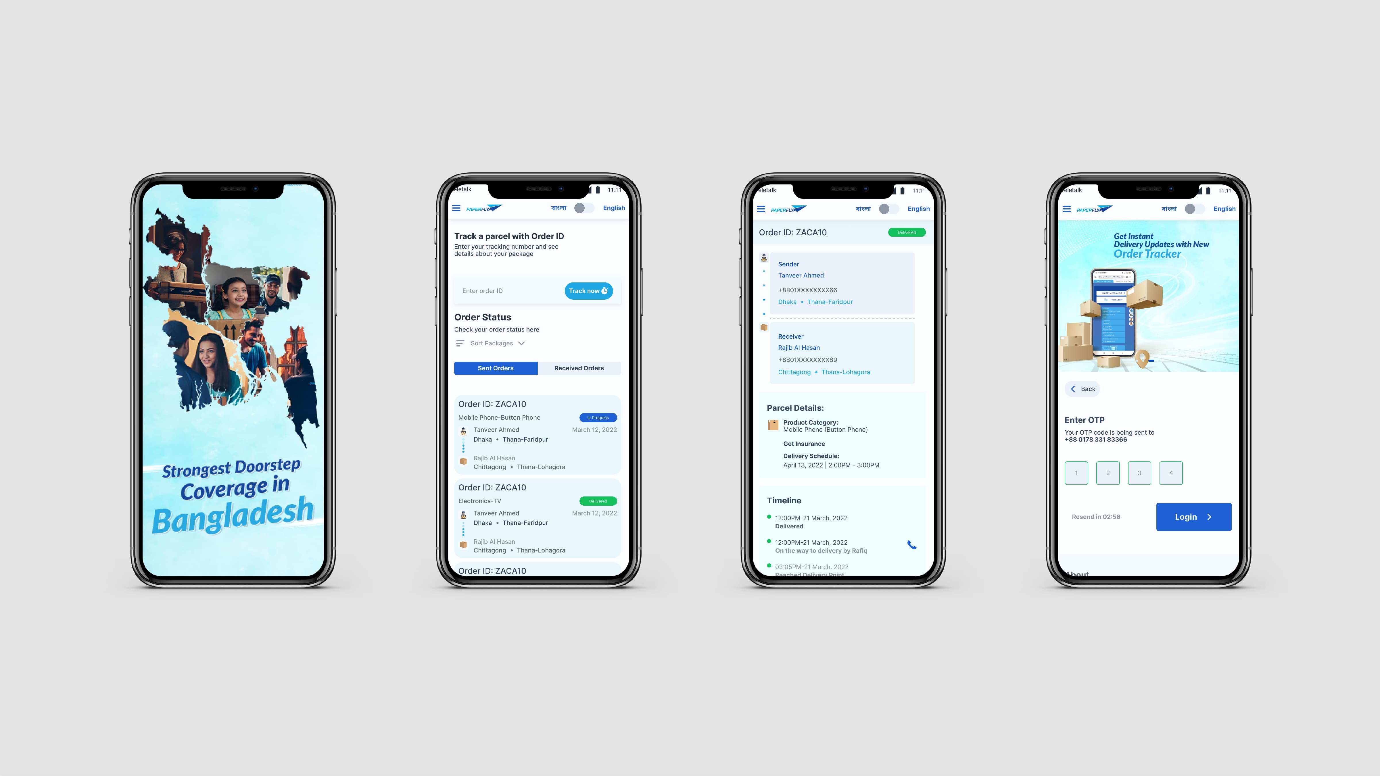
Paperfly is a one-stop logistics solutions provider company. They offer doorstep delivery services all around Bangladesh, along with warehousing and fulfillment facilities. Their main goal is to develop an infrastructure that enables the pathway for a successful e-commerce drive. Paperfly offers standard services to all small/medium online merchants. We designed the merchant App, C2C App, Merchant Web Portal, and Paperfly Portfolio Website.
Scope of Work
Roles
Challenges
Making a system that will serve both customers and business owners who will be using the app was one of the main challenges. Additionally, making both of these journeys seamless for the users and maintaining consistency throughout the app was crucial.
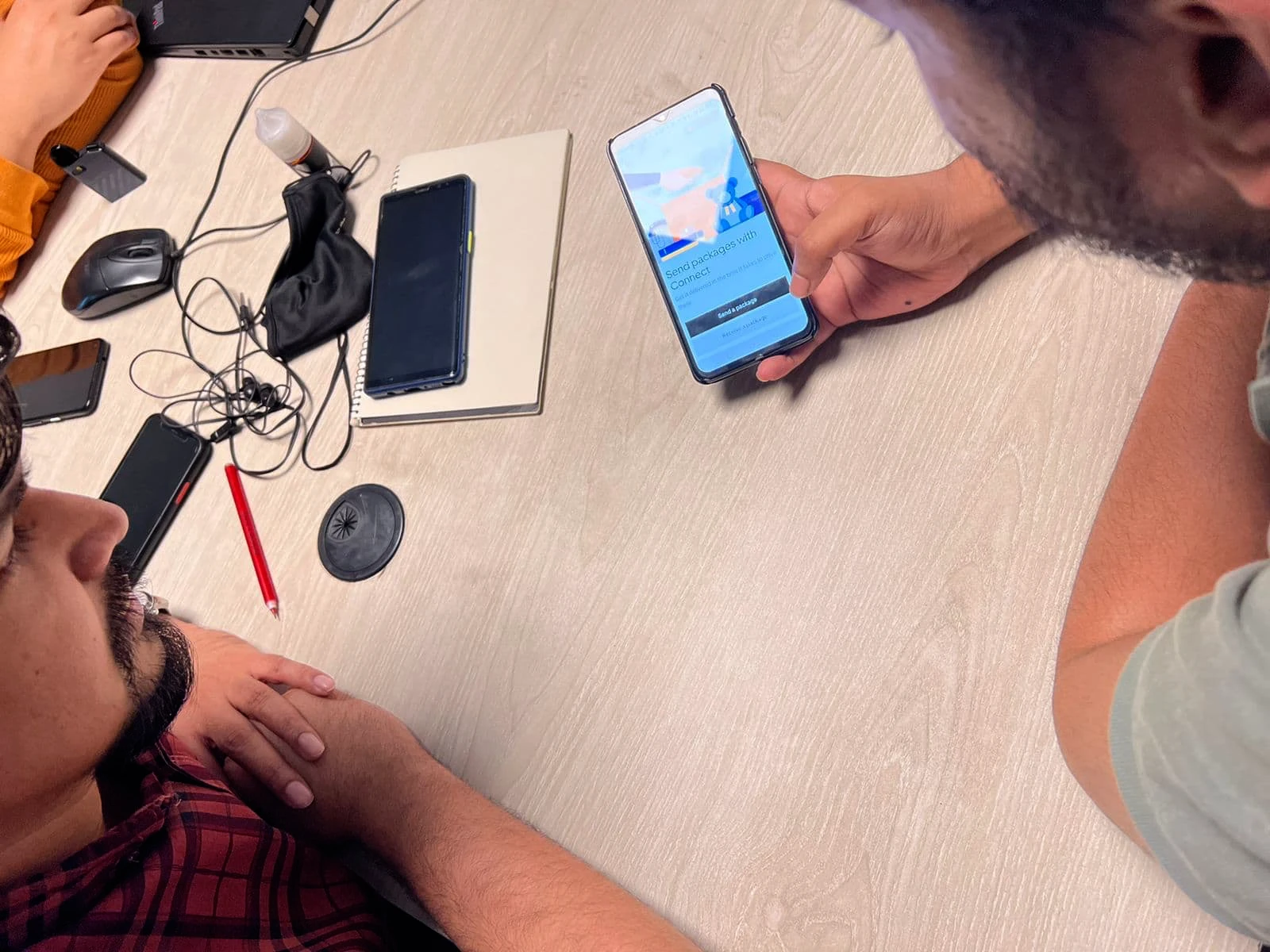
User Research and Analysis
We began by conducting competitor analysis through user interviews and surveys to identify the most popular apps for package delivery. The most popular platforms, according to the information we gathered, were RedX, Uber, and Pathao. We conducted interviews with users from these platforms, as well as, interviews with Paperfly's existing merchants to get a clear picture of their frustrations and needs. After compiling all these data and analyzing them, we came up with UX Personas.
From these data we learned most of our users are males aged between 25-30 situated in Dhaka. More importantly, we learned that the services most used by them are Pathao, Uber, and Red X. Next came the user interviews. We also held sessions with Paperfly merchants, along with one on one sessions with Paperfly's customer support team to get a complete picture of their frustrations with the existing system and identified experiences that could be made more efficient.
Key Points from Interviews
UX Personas & User Journey
After analyzing the data and identifying the needs of the users and their frustrations, we came up with user journeys and UX Personas. Our goal was simple, make the journey efficient and simple for everybody.
UX Personas
Creating multiple UX Personas helped the team define clear goals. It also helped us identify the user's frustrations and motivations. Below is a sample of one of many UX Personas we came up with.


Waliun is a Line Producer at a production house. He has 2 years of experience working with different projects in the industry.
His line of work means he has to send and receive a lot of items on the go, often with time constraints.
Being able to collect and send multiple things on the go.
Google Map integration to make the address selection faster and more accurate.
Deliveries to be made within the shortest time possible.
Expects to be able to communicate withthe delivery agent through the app.
Send documents and hard drives to his clients quickly.
Being able to chat with the delivery agent through the app.
Riders are readily available.
App is user friendly.
Google Map is not integrated in the app. Pathao's map lacks accuracy, therefore he has to waste time trying to set a pin point location.
Frequently used addresses cannot be saved so he has to type in the same addresses again and again.
Pathao delivery agents are also riders, once or twice, his delivery was delayed by more than 2 hours due to this.
Solutions & User Journey
After creating the UX Personas, our team sat down with clear goals and solutions. This led to us creating a user journey.
Solutions
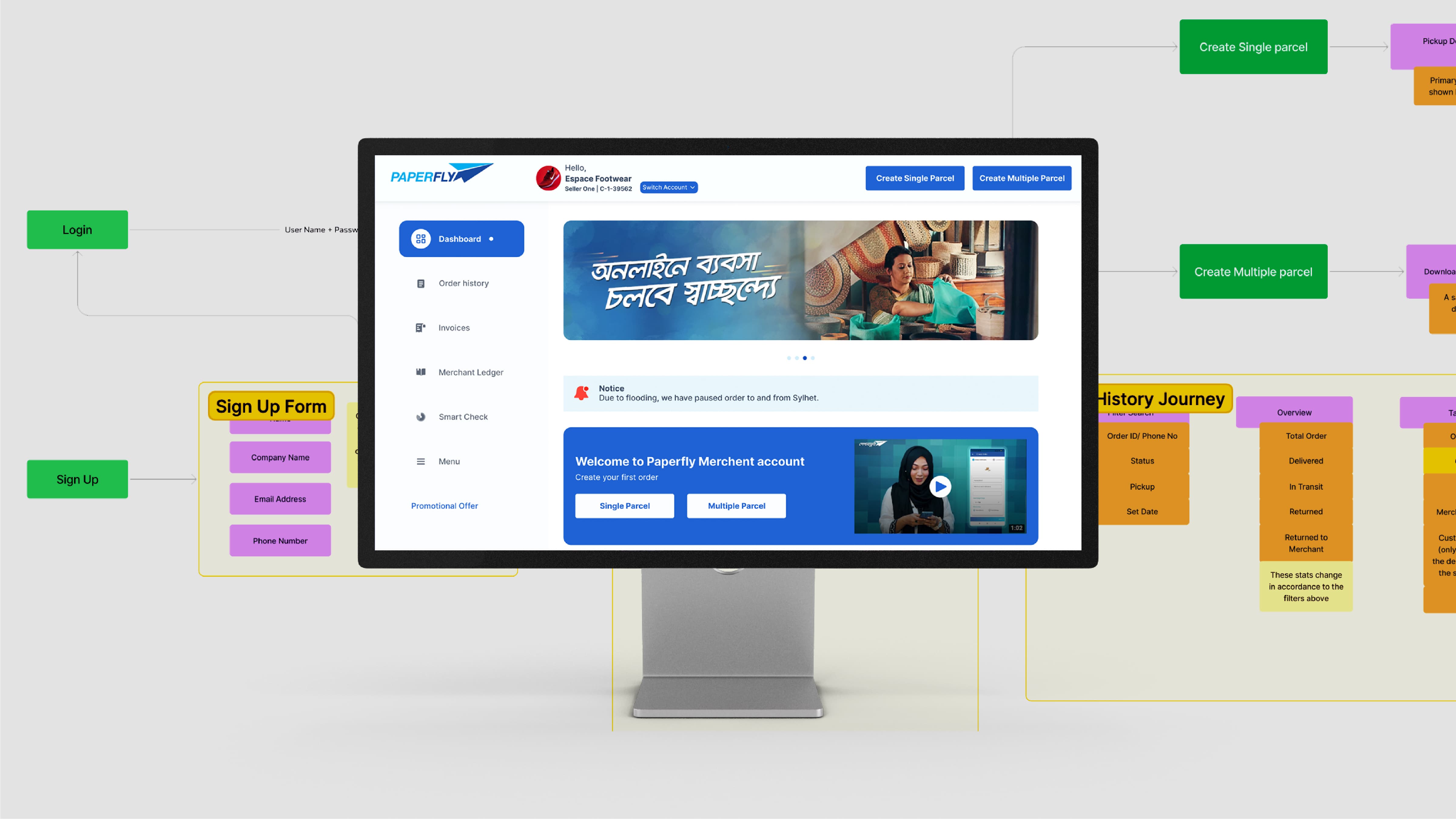
Wireframes
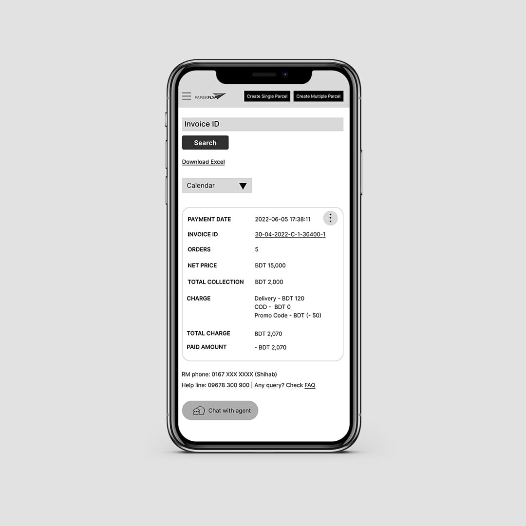
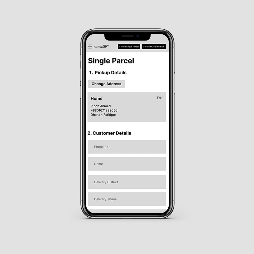
Wireframing was done with an emphasis on the user's journey's simplicity and efficiency. We made sure that there were fewer clicks required to send or receive parcels, whether it was a single or mass delivery. With user feedback in mind, we created a very clear and concise financial system with easily sortable, filterable, and printable invoices and financial records.
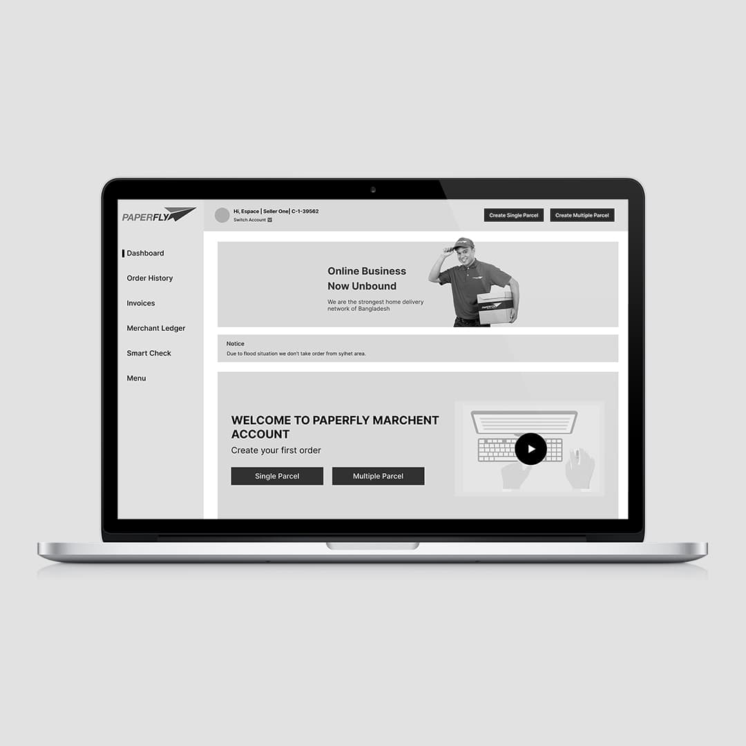
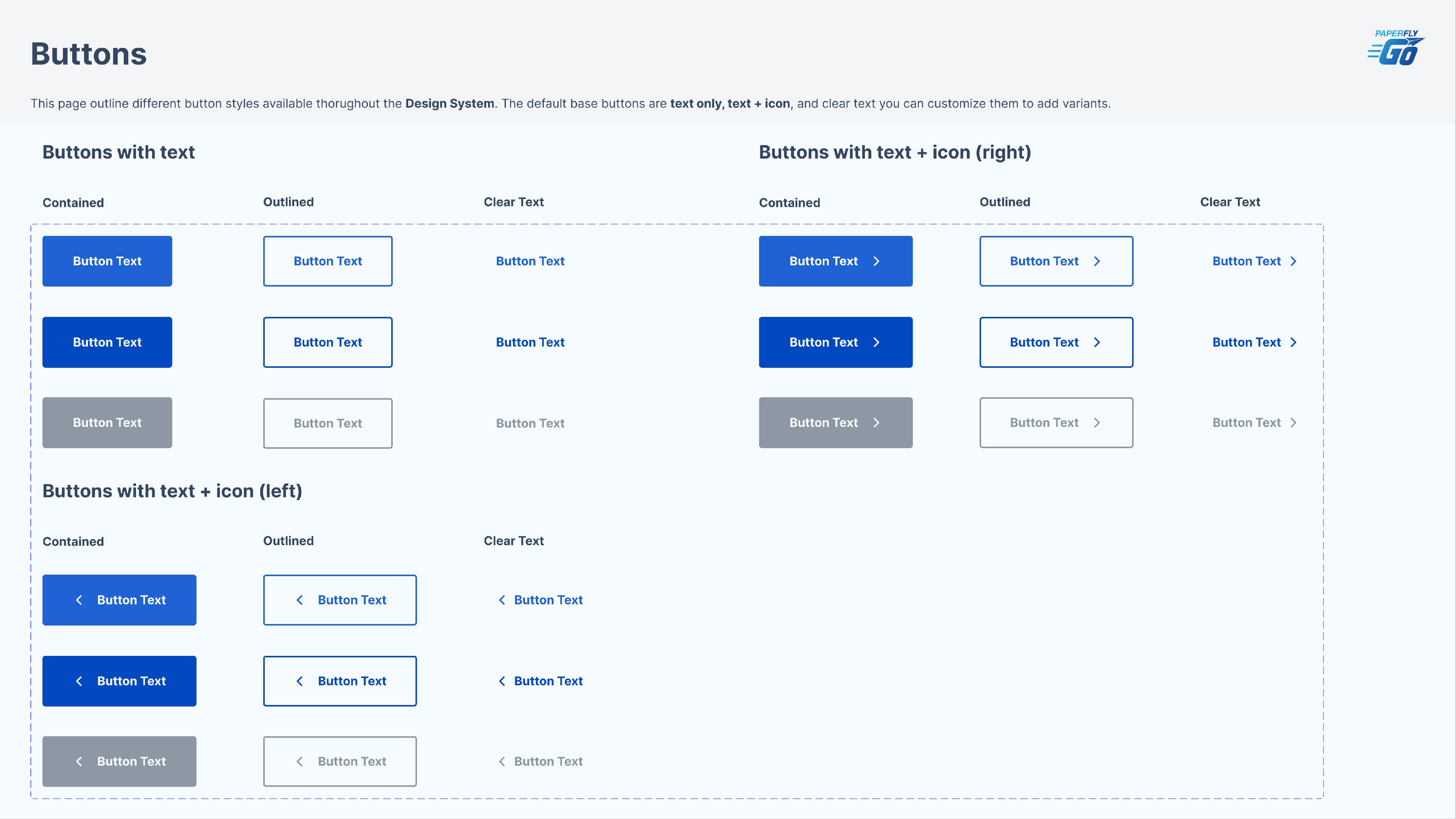
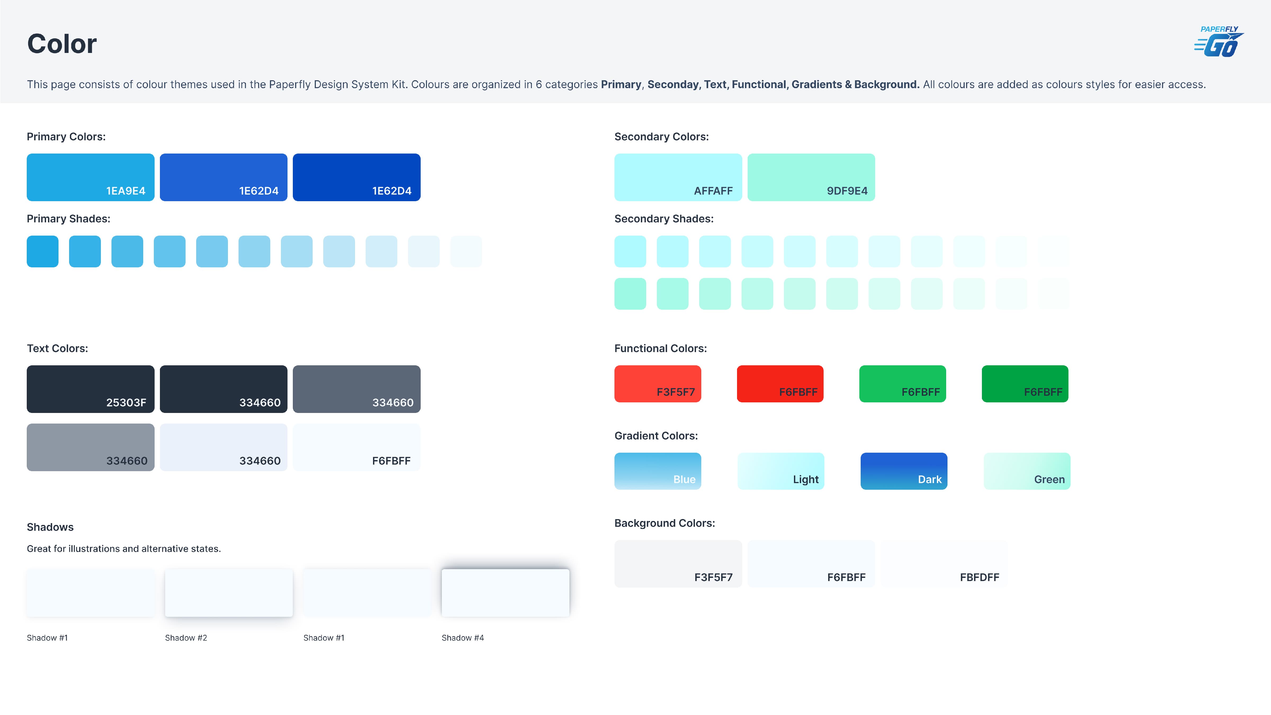
UI Design
Using simple color schemes and clean designs, we brought the entire system to life. Our design system was comprehensive to make life easier for developers and consequently end users. We made sure the interface was simple to use and the key journeys were clearly visible. For the convenience of new users, we added video tutorials. All this resulted in a clean look and a simple journey for the users


Conclusion
We gained insight into the various issues that users of a service like this might encounter. We also discovered which issues were worth solving and which ones were not because of the price of features. We also learned how the client's various teams have various needs and how to combine these solutions into a single system.


